
This picture is abstract in the sense that it is different in its approach in meeting its target audience. For the reason mainly this is why we chose this film magazine as our inspiration! The layout of the picture is different and we believe it will appeal to our target audience.
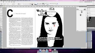 This is our final product of our magazine review. As you can see it corresponds with our inspiration, however we used black and white to represent that it is clear and evident that youth are struggling to find their identity and the red tear drop is in colour because it shows youth are hurting because their identity is unknown and also that youth are seen as miscreants which is a negative portrayal.
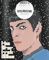
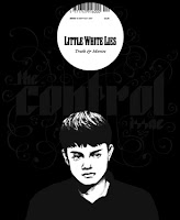
Below are different editions of Little White Lies:

No comments:
Post a Comment